GDACS (Global Disaster Alert and Coordination System) is a critical platform developed by the European Commission and the United Nations to support early warning, real-time coordination, and information sharing during global disasters.
However, even if its role is important for providing essential disaster alerts and coordination tools to a global audience, its current interface lacks clarity, consistency, and user-centered design.
My design responds to these needs with a more intuitive layout, improved readability, and a consistent visual language that makes it easier for users across sectors (NGOs, government agencies, analysts, and the general public) to take action quickly.
Used tools
Figma
Status
In progress
Content
GDACS (Global Disaster Alert and Coordination System) is a critical platform developed by the European Commission and the United Nations to support early warning, real-time coordination, and information sharing during global disasters.
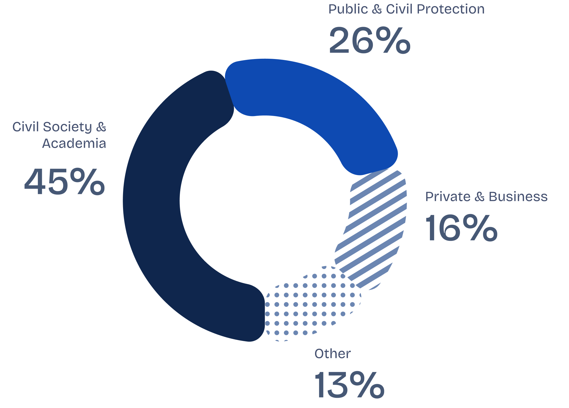
The redesign is informed by insights from the 2023–2024 GDACS User Consultation Report, which highlighted users’ need for faster access to key information, simplified navigation, and a clearer visual hierarchy — especially under time pressure.


From an in-depth analysis of the current GDACS website, several usability, accessibility, and structural challenges emerged that affect both the overall experience and the platform’s operational efficiency. The review included an evaluation of the navigation flow, visual hierarchy, responsiveness, and information structure.
Problem 1
Complex navigation.
Users struggle to find key information quickly — especially during high-pressure events.
Problem 2
Poor visual hierarchy.
Dense text and technical data make it difficult to scan and prioritize key insights.
Problem 3
Lack of personalized dashboard for user-specific insights.
users can't tailor information to their regions, hazard types, or operational priorities.
Problem 4
Weak mobile experience.
Many users rely on mobile devices in the field, but the current platform isn’t optimized for them
Problem 5
Underused advanced features. Advanced features like APIs, exposure estimates, and analysis tools are difficult to access or understand due to poor onboarding.
This phase focused on creating a well-structured information architecture, refining user flows, and organizing features into coherent clusters to enhance usability and clarity.
Information architecture
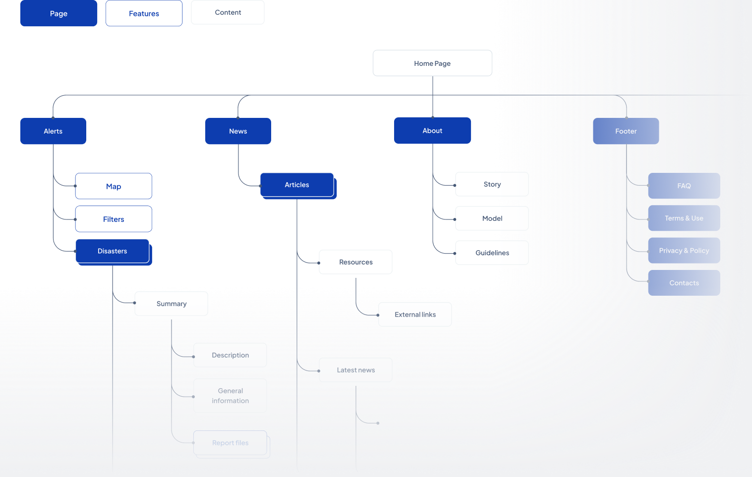
Userflow

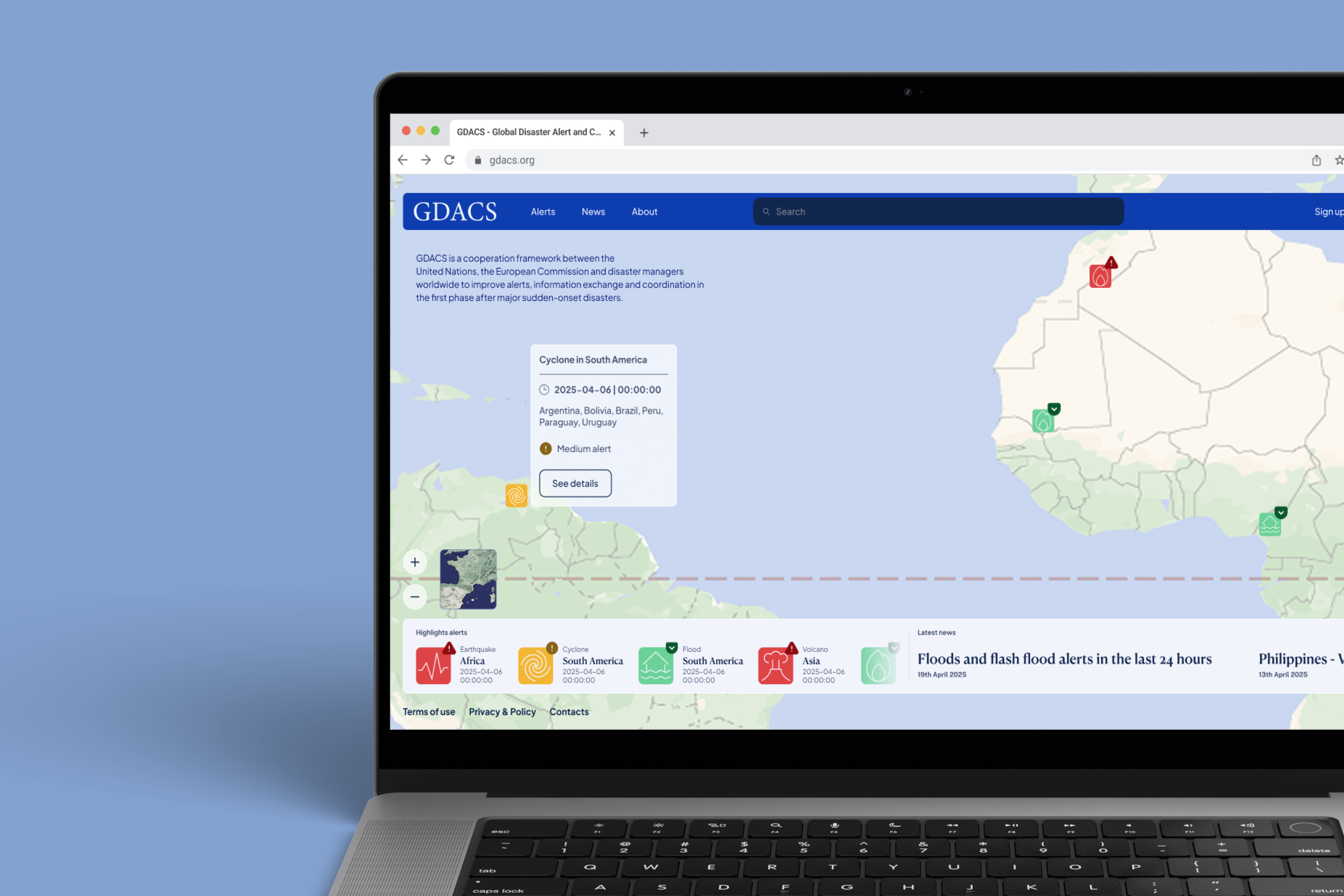
home page
Navigable map with shortcuts to latest alerts and news. Introducing a filter function that personalize search of alerts.
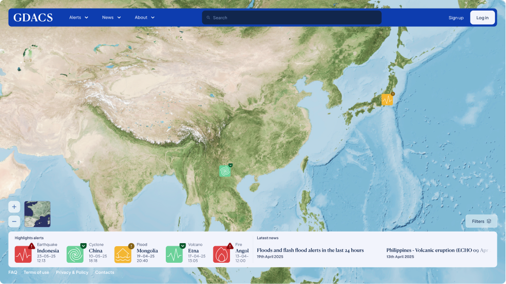
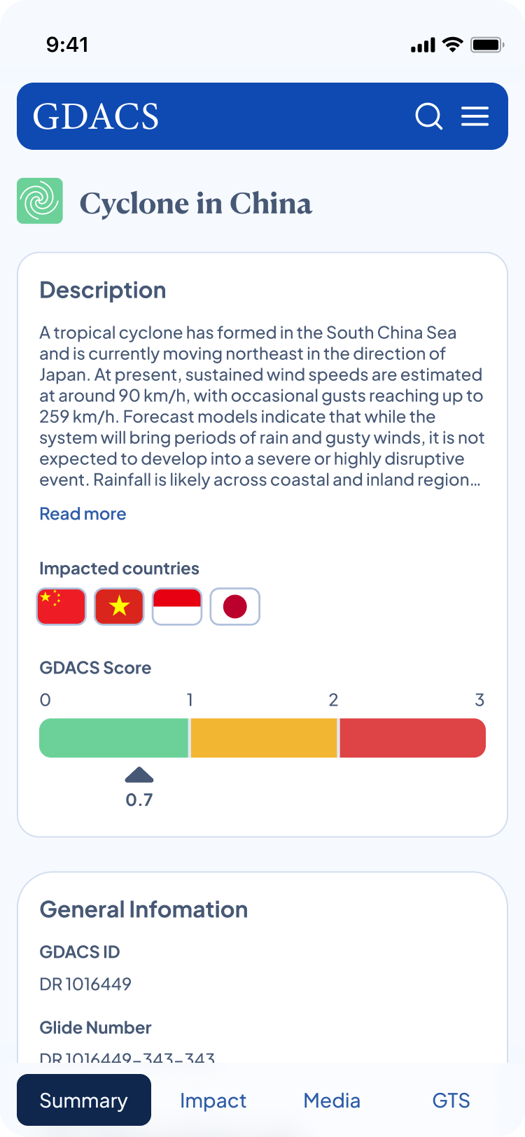
Alert page
Detailed alert page with easier filter search and a table with alerts and links to specific alerts.
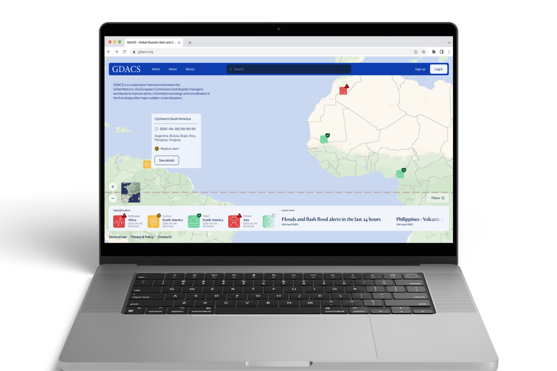
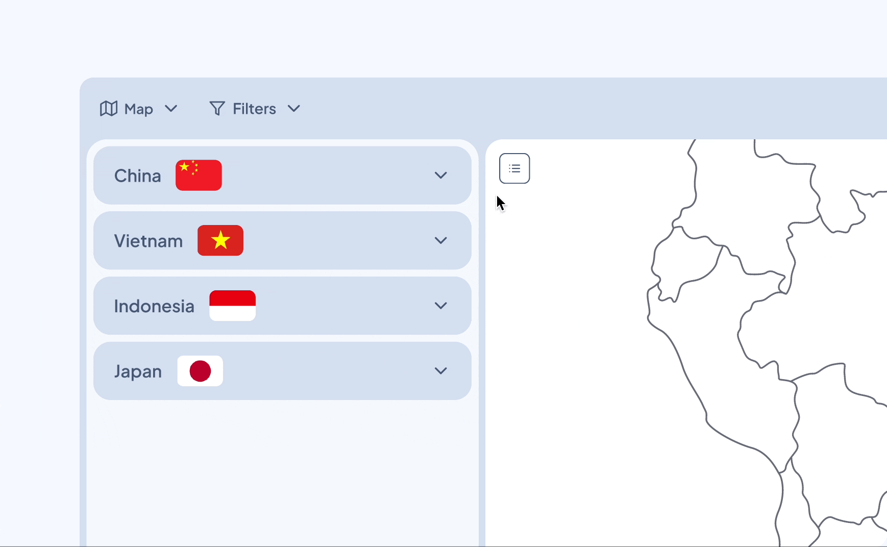
table & maps
Changeable/Dynamic widget that allows different visualization of data.
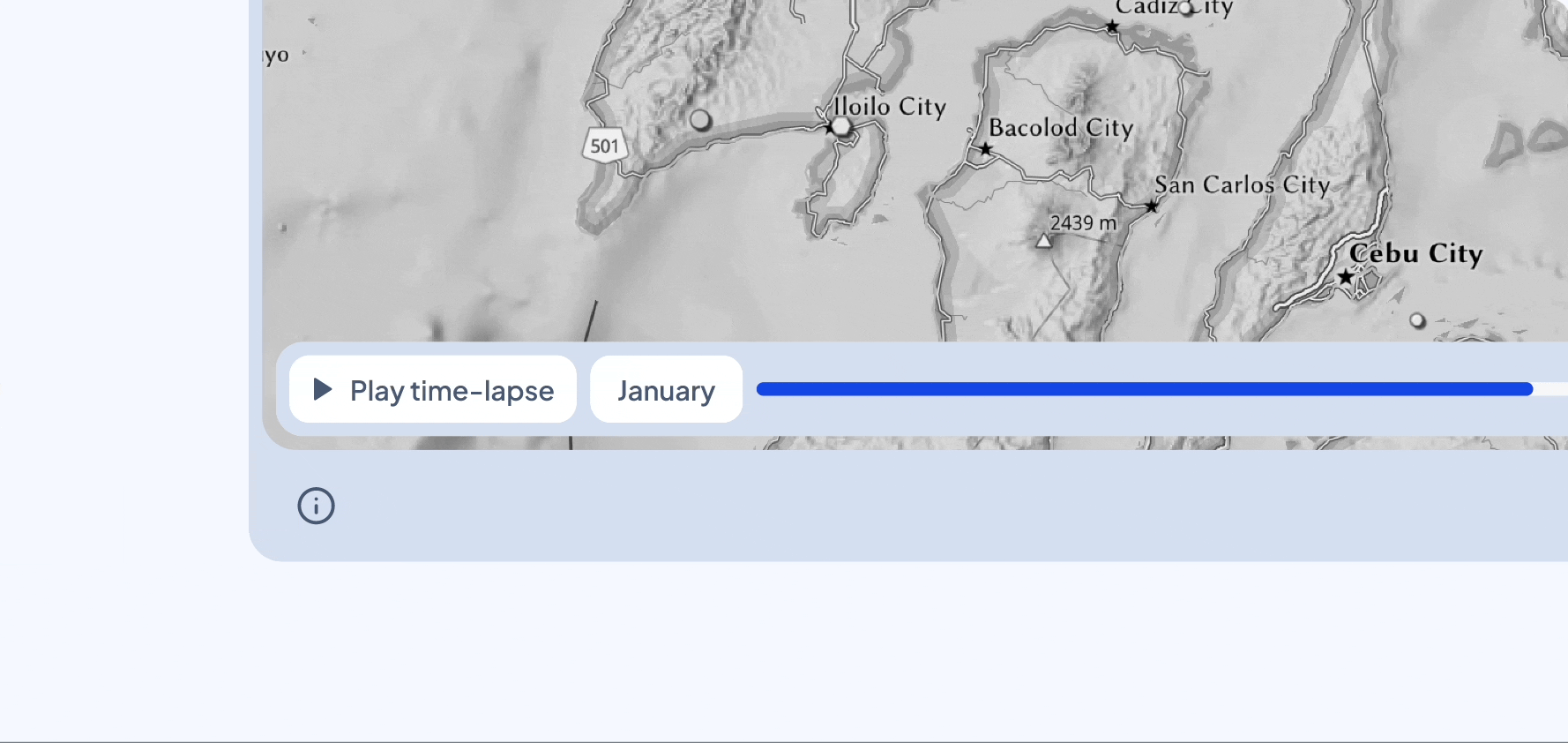
Comparison
Toggle feature to compare different data information in different times.
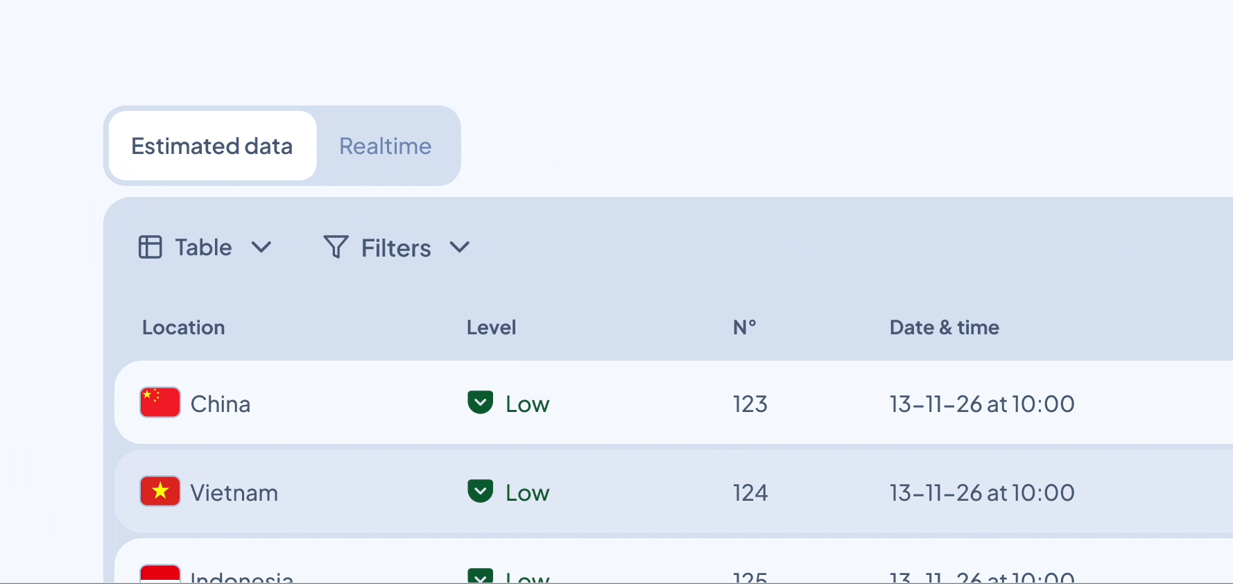
Downloadable data & data details
Each dataset is downloadable in multiple formats, and the source is always clearly indicated to ensure transparency and reliability.
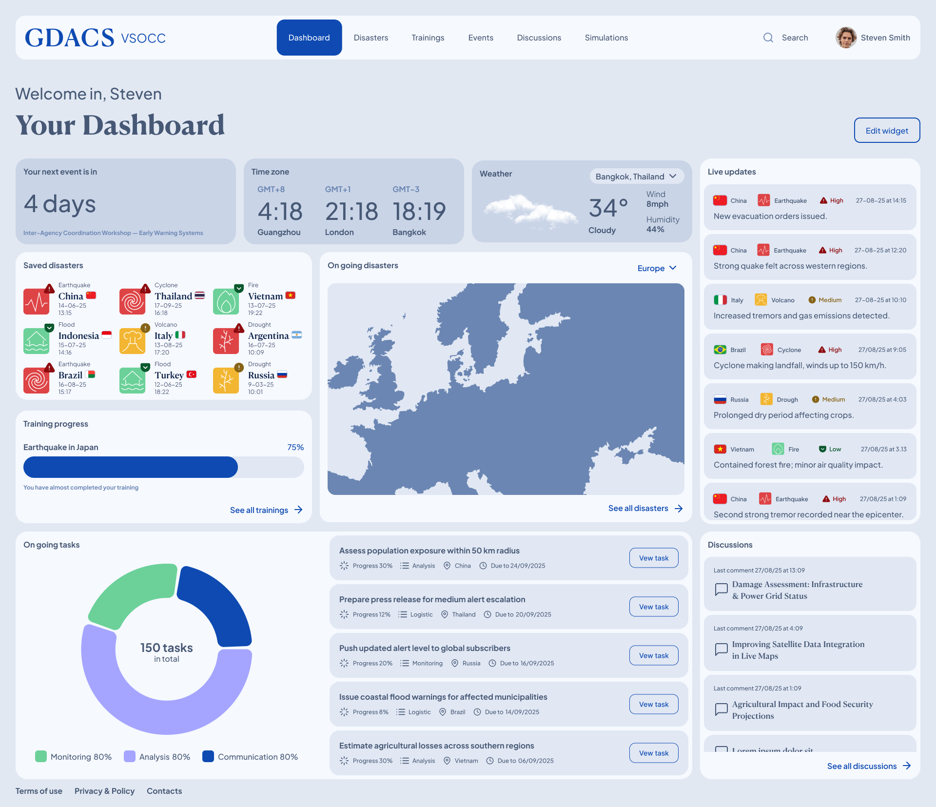
dashboard
Once logged in, the user is presented with a personalized dashboard that provides an overview of ongoing operations.
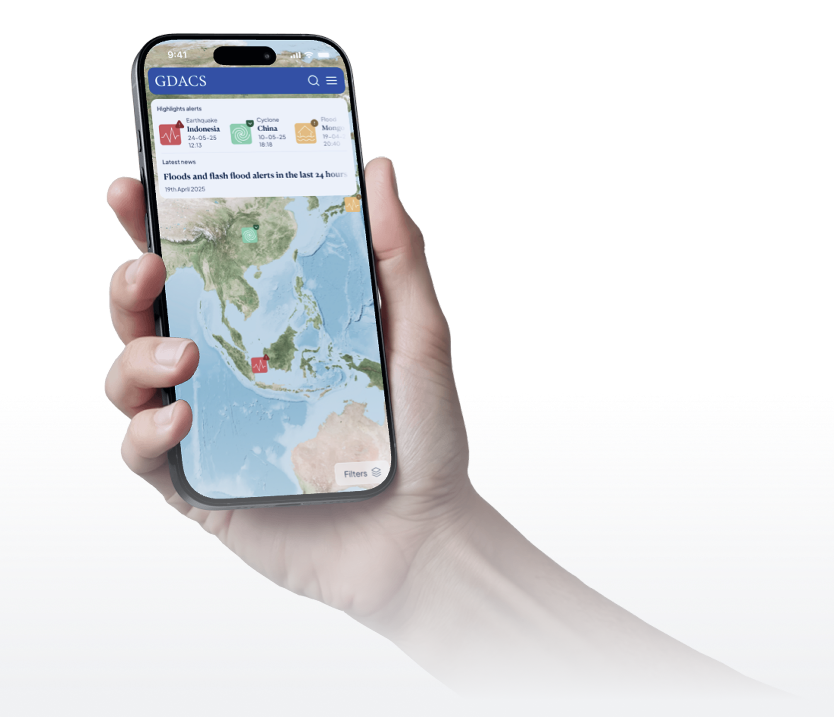
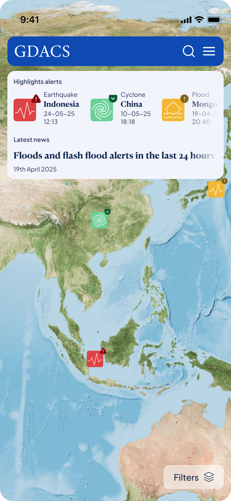
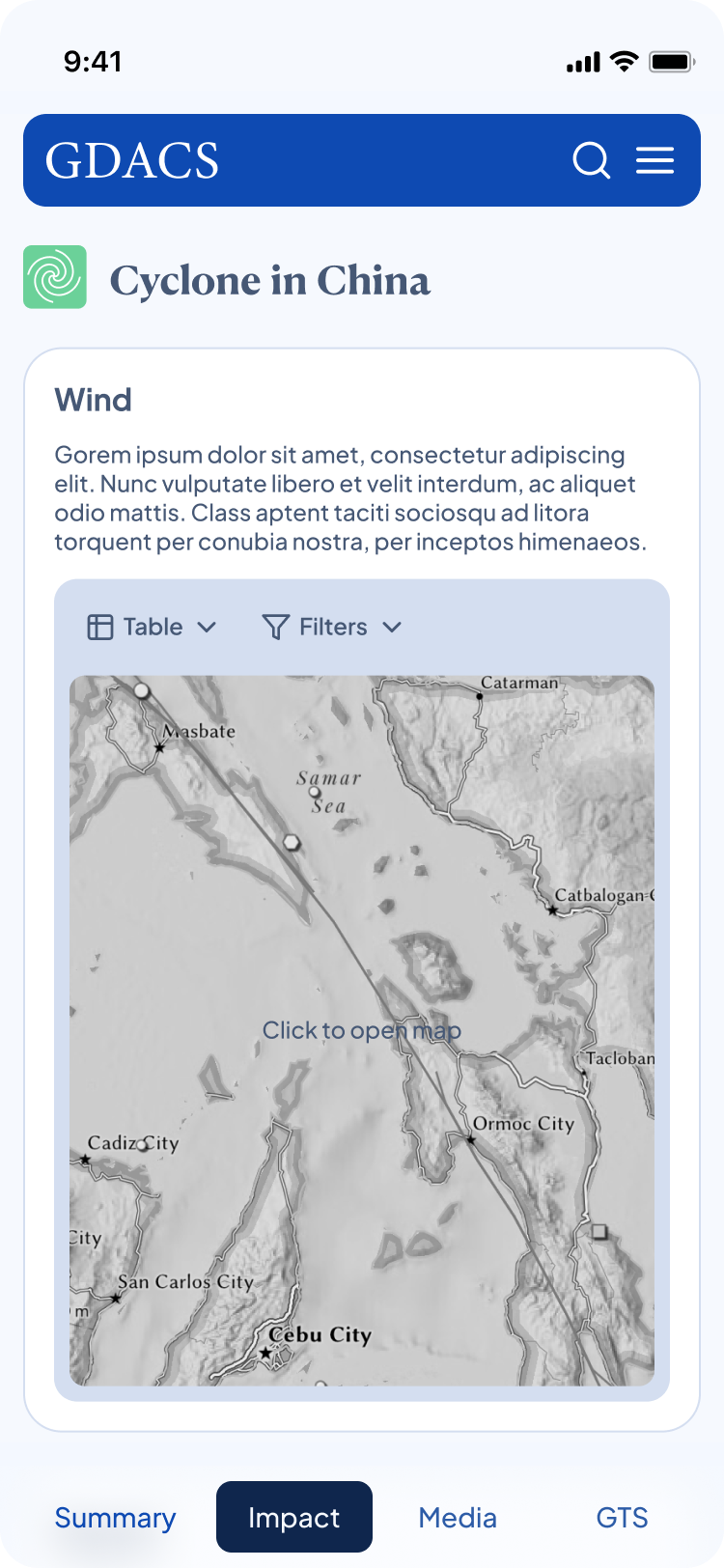
Mobile version
The mobile version features a responsive and lightweight design that prioritizes essential alerts and data for quick access in the field.
design system
To ensure consistency and scalability, guidelines were defined for typography, grid structure, color palette, and reusable components.


